Worst UX ever in Google Search
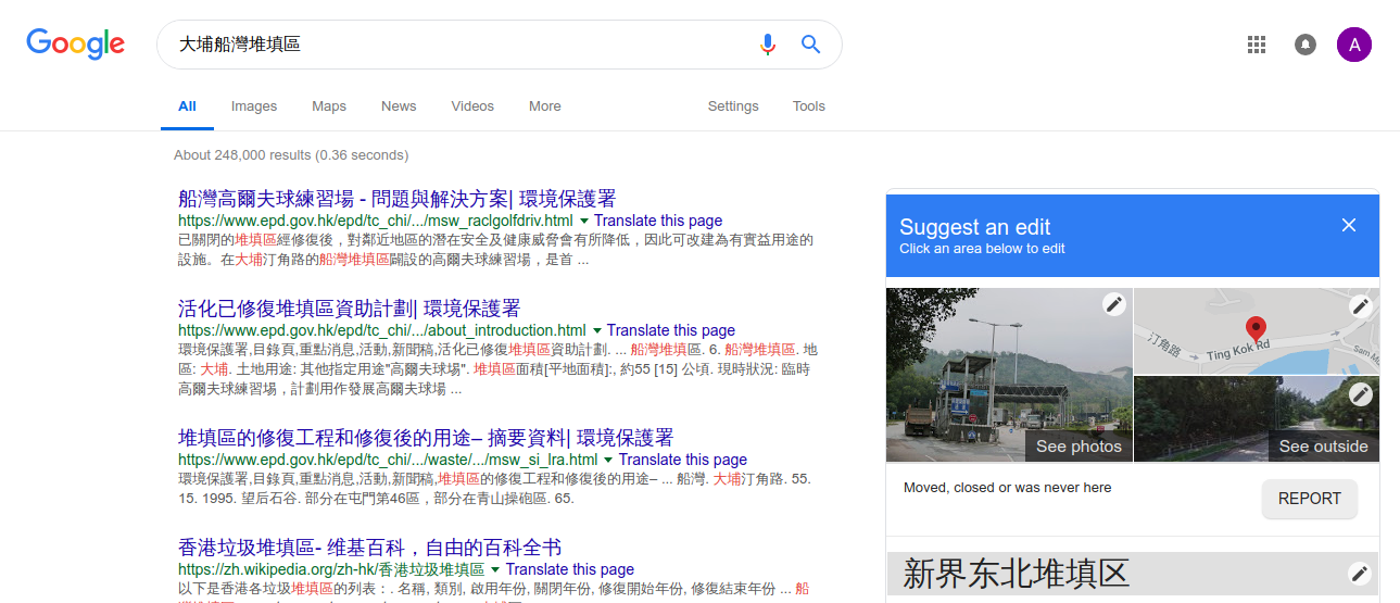
So I was searching for 大埔船灣堆填區, a landfill closed in 1997, and
currently rebuilt as a golf course. For some strange reason Google
decides to show me a map result of 新界東北堆填區 (in the wrong language,
even!), despite the correct web search results… (Note: screenshot taken
after whatever follows. The little map segment on the right originally
showed Ta Kwu Ling.)

(Signature)
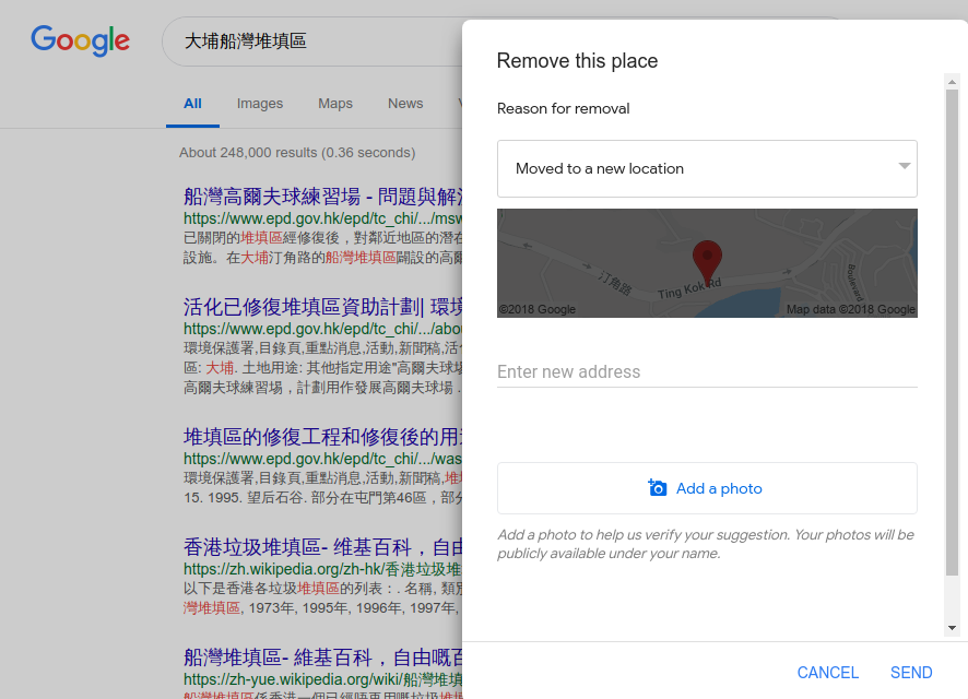
So I scrolled down that right sidebar and found a “Feedback” button.
Clicking on it brings up an edit icon on each of the sidebar fields, plus
a button “REPORT” for “Moved, closed or was never here”. Clicking on it
brings another box…

(Signature)
None of the options fix perfectly, so I just went with the one that allowed
me to add a correct address. Note how there is literally NO input fields
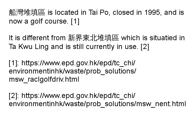
that would allow me to comment on what’s wrong. I did notice an image input
though, so, under the naive assumption that a Google employee would look
at the image, I uploaded this…

(Signature)
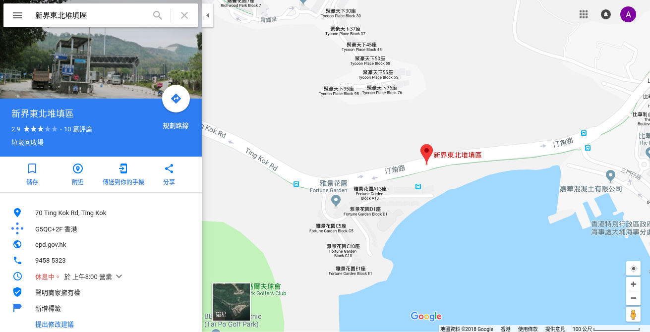
Guess what that did? I have successfully changed the address of
新界東北堆填區 to Tai Po. Right now, if you search for
新界東北堆填區 in Google Maps, it would show you a marker on
Ting Kok Road.

(Signature)
If this doesn’t win the award for the worst UX of the year I don’t know what will.